2022-05-29 Evolving String using Genetic Algorithm (Part 2 - Visualisations & Analysis)
#post #python
This post originally appeared on Blog 2.0
This is a continuation of Part 1 of Evolving String using Genetic Algorithm. It’s time to fire up pandas and seaborn and pyplot again!
H2 Setting up
import pandas as pd
import seaborn as sns
import matplotlib.pyplot as plt
sns.set_theme()
Load the data
results = pd.read_csv('results.csv')
Table 1: Raw Data
A total number of 84 experiments were conducted, each of which involved 5 trials, and each trial had 1000 data points. There are, as a result, 420,000 rows in the data table. Therefore, only the head and tail of the data table are shown here.
results
| Unnamed: 0 | experiment_id | trial_num | population_size | mutation_rate | cross_strat | target | char_set | generation_num | avg_fitnesses | num_target_hits | |
|---|---|---|---|---|---|---|---|---|---|---|---|
| 0 | 0 | 0.0 | 0.0 | 50.0 | 0.0005 | midpoint | multiply, vary, let the strongest live and the... | abcdefghijklmnopqrstuvwxyz,. | 1.0 | 0.052069 | 0.0 |
| 1 | 1 | 0.0 | 0.0 | 50.0 | 0.0005 | midpoint | multiply, vary, let the strongest live and the... | abcdefghijklmnopqrstuvwxyz,. | 2.0 | 0.062069 | 0.0 |
| 2 | 2 | 0.0 | 0.0 | 50.0 | 0.0005 | midpoint | multiply, vary, let the strongest live and the... | abcdefghijklmnopqrstuvwxyz,. | 3.0 | 0.064828 | 0.0 |
| 3 | 3 | 0.0 | 0.0 | 50.0 | 0.0005 | midpoint | multiply, vary, let the strongest live and the... | abcdefghijklmnopqrstuvwxyz,. | 4.0 | 0.077241 | 0.0 |
| 4 | 4 | 0.0 | 0.0 | 50.0 | 0.0005 | midpoint | multiply, vary, let the strongest live and the... | abcdefghijklmnopqrstuvwxyz,. | 5.0 | 0.080690 | 0.0 |
| ... | ... | ... | ... | ... | ... | ... | ... | ... | ... | ... | ... |
| 419995 | 995 | 83.0 | 4.0 | 1000.0 | 0.1000 | random | multiply, vary, let the strongest live and the... | abcdefghijklmnopqrstuvwxyz,. | 996.0 | 0.156500 | 0.0 |
| 419996 | 996 | 83.0 | 4.0 | 1000.0 | 0.1000 | random | multiply, vary, let the strongest live and the... | abcdefghijklmnopqrstuvwxyz,. | 997.0 | 0.157448 | 0.0 |
| 419997 | 997 | 83.0 | 4.0 | 1000.0 | 0.1000 | random | multiply, vary, let the strongest live and the... | abcdefghijklmnopqrstuvwxyz,. | 998.0 | 0.157207 | 0.0 |
| 419998 | 998 | 83.0 | 4.0 | 1000.0 | 0.1000 | random | multiply, vary, let the strongest live and the... | abcdefghijklmnopqrstuvwxyz,. | 999.0 | 0.160914 | 0.0 |
| 419999 | 999 | 83.0 | 4.0 | 1000.0 | 0.1000 | random | multiply, vary, let the strongest live and the... | abcdefghijklmnopqrstuvwxyz,. | 1000.0 | 0.158828 | 0.0 |
420000 rows × 11 columns
H2 Downscaling dataset
There are simply way too many data points to deal with. Looks like we could have recorded data less frequently. In that case, we will take data points at intervals of 10 generations.
And… Oops, we didn’t record stats for generation 0! What a blunder. Since the experiment took two hours to run, we’ll just include generation 1 as the first data point.
processed = results[(results['generation_num'] % 10 == 0) | (results['generation_num'] == 1)]
processed['hyper'] = 'P: ' + processed["population_size"].astype(str) + '; R: ' + processed["mutation_rate"].astype(str) + '; S: ' + processed["cross_strat"].astype(str)
processed
/var/folders/tt/63g2nkx15fl855gr711x66540000gn/T/ipykernel_23030/3281391435.py:2: SettingWithCopyWarning:
A value is trying to be set on a copy of a slice from a DataFrame.
Try using .loc[row_indexer,col_indexer] = value instead

See the caveats in the documentation: https://pandas.pydata.org/pandas-docs/stable/user_guide/indexing.html#returning-a-view-versus-a-copy
  processed['hyper'] = 'P: ' + processed["population_size"].astype(str) + '; R: ' + processed["mutation_rate"].astype(str) + '; S: ' + processed["cross_strat"].astype(str)
| Unnamed: 0 | experiment_id | trial_num | population_size | mutation_rate | cross_strat | target | char_set | generation_num | avg_fitnesses | num_target_hits | hyper | |
|---|---|---|---|---|---|---|---|---|---|---|---|---|
| 0 | 0 | 0.0 | 0.0 | 50.0 | 0.0005 | midpoint | multiply, vary, let the strongest live and the... | abcdefghijklmnopqrstuvwxyz,. | 1.0 | 0.052069 | 0.0 | P: 50.0; R: 0.0005; S: midpoint |
| 9 | 9 | 0.0 | 0.0 | 50.0 | 0.0005 | midpoint | multiply, vary, let the strongest live and the... | abcdefghijklmnopqrstuvwxyz,. | 10.0 | 0.107241 | 0.0 | P: 50.0; R: 0.0005; S: midpoint |
| 19 | 19 | 0.0 | 0.0 | 50.0 | 0.0005 | midpoint | multiply, vary, let the strongest live and the... | abcdefghijklmnopqrstuvwxyz,. | 20.0 | 0.143793 | 0.0 | P: 50.0; R: 0.0005; S: midpoint |
| 29 | 29 | 0.0 | 0.0 | 50.0 | 0.0005 | midpoint | multiply, vary, let the strongest live and the... | abcdefghijklmnopqrstuvwxyz,. | 30.0 | 0.188966 | 0.0 | P: 50.0; R: 0.0005; S: midpoint |
| 39 | 39 | 0.0 | 0.0 | 50.0 | 0.0005 | midpoint | multiply, vary, let the strongest live and the... | abcdefghijklmnopqrstuvwxyz,. | 40.0 | 0.207586 | 0.0 | P: 50.0; R: 0.0005; S: midpoint |
| ... | ... | ... | ... | ... | ... | ... | ... | ... | ... | ... | ... | ... |
| 419959 | 959 | 83.0 | 4.0 | 1000.0 | 0.1000 | random | multiply, vary, let the strongest live and the... | abcdefghijklmnopqrstuvwxyz,. | 960.0 | 0.154362 | 0.0 | P: 1000.0; R: 0.1; S: random |
| 419969 | 969 | 83.0 | 4.0 | 1000.0 | 0.1000 | random | multiply, vary, let the strongest live and the... | abcdefghijklmnopqrstuvwxyz,. | 970.0 | 0.156328 | 0.0 | P: 1000.0; R: 0.1; S: random |
| 419979 | 979 | 83.0 | 4.0 | 1000.0 | 0.1000 | random | multiply, vary, let the strongest live and the... | abcdefghijklmnopqrstuvwxyz,. | 980.0 | 0.161483 | 0.0 | P: 1000.0; R: 0.1; S: random |
| 419989 | 989 | 83.0 | 4.0 | 1000.0 | 0.1000 | random | multiply, vary, let the strongest live and the... | abcdefghijklmnopqrstuvwxyz,. | 990.0 | 0.160724 | 0.0 | P: 1000.0; R: 0.1; S: random |
| 419999 | 999 | 83.0 | 4.0 | 1000.0 | 0.1000 | random | multiply, vary, let the strongest live and the... | abcdefghijklmnopqrstuvwxyz,. | 1000.0 | 0.158828 | 0.0 | P: 1000.0; R: 0.1; S: random |
42420 rows × 12 columns
H2 Overview visualisation
Right now, let’s just mindlessly plot everything and see what happens.
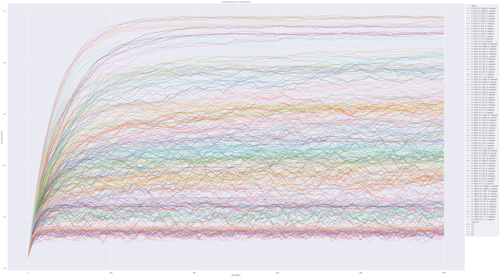
Graph 1: Average Fitness over Generations
The average fitness for each trial for each experiment is plotted here. Looks like it’s a mess—we can’t really read much out of this graph alone. At least we know that evolution slowed down over time and there are fluctuations.
plt.figure(figsize=(50, 30))
ax = sns.lineplot(x="generation_num", y="avg_fitnesses", data=processed, palette="tab20", hue="hyper", style="trial_num")

ax.set_title('average fitness over generations')
ax.set_xlabel('generation')
ax.set_ylabel('average fitness')
sns.move_legend(ax, "upper left", bbox_to_anchor=(1, 1))

plt.show()
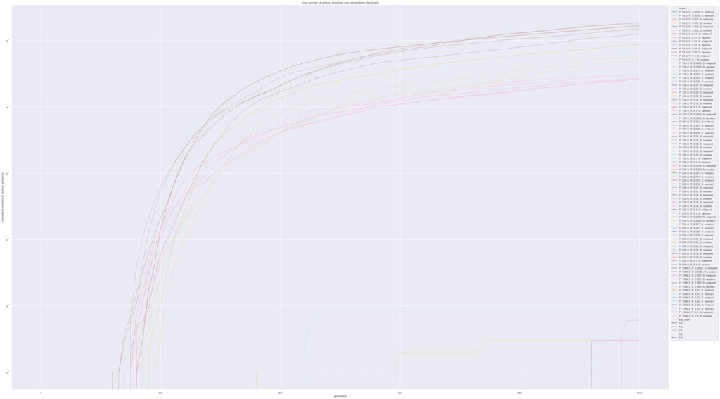
Graph 2: Number of Perfect Matches over Generations (log scale)
Out of curiosity, we recorded the cumulative number of individuals that have a genome that’s exactly the same as the target genome. We’re beginning to see something interesting here. All trials of the brown and pink experiments reached relatively high numbers, three trials of the yellow experiments took off, and every other experiment kind of lay at the bottom.
plt.figure(figsize=(50, 30))
ax = sns.lineplot(x="generation_num", y="num_target_hits", data=processed, palette="tab20", hue="hyper", style="trial_num")

ax.set_title('total number of optimal genomes over generations (log scale)')
ax.set_xlabel('generation')
ax.set_ylabel('cumulative number of optimal genomes')
sns.move_legend(ax, "upper left", bbox_to_anchor=(1, 1))

plt.yscale('log')
plt.show()
H2 Matrix
Well, just so that we have a less overwhelming visualisation, maybe it helps to have more summary statistics. We’ll begin by only taking the final generation and taking means over 5 trials for each experiment. Then we’ll make pivot tables of variables that we care about.
final_gen_summary = processed[processed['generation_num'] == 1000]
final_gen_summary = final_gen_summary.groupby(by=['experiment_id', 'cross_strat', 'population_size', 'mutation_rate'], as_index=False).mean()
final_gen_summary = final_gen_summary.drop(columns=['Unnamed: 0', 'trial_num'])

final_gen_summary
| experiment_id | cross_strat | population_size | mutation_rate | generation_num | avg_fitnesses | num_target_hits | |
|---|---|---|---|---|---|---|---|
| 0 | 0.0 | midpoint | 50.0 | 0.0005 | 1000.0 | 0.330966 | 0.0 |
| 1 | 1.0 | random | 50.0 | 0.0005 | 1000.0 | 0.402483 | 0.0 |
| 2 | 2.0 | midpoint | 50.0 | 0.0010 | 1000.0 | 0.343793 | 0.0 |
| 3 | 3.0 | random | 50.0 | 0.0010 | 1000.0 | 0.422000 | 0.0 |
| 4 | 4.0 | midpoint | 50.0 | 0.0050 | 1000.0 | 0.421586 | 0.0 |
| ... | ... | ... | ... | ... | ... | ... | ... |
| 79 | 79.0 | random | 1000.0 | 0.0200 | 1000.0 | 0.472955 | 0.0 |
| 80 | 80.0 | midpoint | 1000.0 | 0.0500 | 1000.0 | 0.242928 | 0.0 |
| 81 | 81.0 | random | 1000.0 | 0.0500 | 1000.0 | 0.263414 | 0.0 |
| 82 | 82.0 | midpoint | 1000.0 | 0.1000 | 1000.0 | 0.147431 | 0.0 |
| 83 | 83.0 | random | 1000.0 | 0.1000 | 1000.0 | 0.158603 | 0.0 |
84 rows × 7 columns
Table 2: Summary Fitness Statistics
A pivot table showing the end of experiment summary statistics of average fitness.
final_gen_fitnesses = final_gen_summary.pivot(index='population_size', columns=['cross_strat', 'mutation_rate'], values='avg_fitnesses')span>&
final_gen_fitnesses
| cross_strat | midpoint | random | ||||||||||||
|---|---|---|---|---|---|---|---|---|---|---|---|---|---|---|
| mutation_rate | 0.0005 | 0.0010 | 0.0050 | 0.0100 | 0.0200 | 0.0500 | 0.1000 | 0.0005 | 0.0010 | 0.0050 | 0.0100 | 0.0200 | 0.0500 | 0.1000 |
| population_size | ||||||||||||||
| 50.0 | 0.330966 | 0.343793 | 0.421586 | 0.340897 | 0.282000 | 0.170138 | 0.125793 | 0.402483 | 0.422000 | 0.448966 | 0.348690 | 0.317586 | 0.212759 | 0.127586 |
| 100.0 | 0.444000 | 0.464034 | 0.530793 | 0.453379 | 0.325759 | 0.203034 | 0.132138 | 0.536931 | 0.599379 | 0.553414 | 0.490828 | 0.380966 | 0.236897 | 0.152690 |
| 150.0 | 0.522506 | 0.566736 | 0.610299 | 0.505126 | 0.360437 | 0.222575 | 0.140069 | 0.683655 | 0.713839 | 0.650368 | 0.543655 | 0.411839 | 0.229034 | 0.151379 |
| 200.0 | 0.600155 | 0.657052 | 0.632069 | 0.536759 | 0.368845 | 0.218948 | 0.138431 | 0.771879 | 0.756466 | 0.701224 | 0.571741 | 0.429517 | 0.257397 | 0.155759 |
| 500.0 | 0.828972 | 0.820034 | 0.755407 | 0.603034 | 0.423917 | 0.240172 | 0.150117 | 0.958400 | 0.903028 | 0.775931 | 0.619572 | 0.458821 | 0.263228 | 0.154641 |
| 1000.0 | 0.933990 | 0.918238 | 0.774448 | 0.621641 | 0.448486 | 0.242928 | 0.147431 | 0.974152 | 0.947997 | 0.782272 | 0.630507 | 0.472955 | 0.263414 | 0.158603 |
Table 3: Summary Hit Count Statistics
another pivot table showing the mean number of indiviuals reaching the target genome.
final_gen_hits = final_gen_summary.pivot(index='population_size', columns=['cross_strat', 'mutation_rate'], values='num_target_hits')span>&
final_gen_hits
| cross_strat | midpoint | random | ||||||||||||
|---|---|---|---|---|---|---|---|---|---|---|---|---|---|---|
| mutation_rate | 0.0005 | 0.0010 | 0.0050 | 0.0100 | 0.0200 | 0.0500 | 0.1000 | 0.0005 | 0.0010 | 0.0050 | 0.0100 | 0.0200 | 0.0500 | 0.1000 |
| population_size | ||||||||||||||
| 50.0 | 0.0 | 0.0 | 0.0 | 0.0 | 0.0 | 0.0 | 0.0 | 0.0 | 0.0 | 0.0 | 0.0 | 0.0 | 0.0 | 0.0 |
| 100.0 | 0.0 | 0.0 | 0.0 | 0.0 | 0.0 | 0.0 | 0.0 | 0.0 | 0.0 | 0.0 | 0.0 | 0.0 | 0.0 | 0.0 |
| 150.0 | 0.0 | 0.0 | 0.0 | 0.0 | 0.0 | 0.0 | 0.0 | 0.0 | 0.0 | 0.0 | 0.0 | 0.0 | 0.0 | 0.0 |
| 200.0 | 0.0 | 0.0 | 0.0 | 0.0 | 0.0 | 0.0 | 0.0 | 0.0 | 0.0 | 0.0 | 0.0 | 0.0 | 0.0 | 0.0 |
| 500.0 | 0.0 | 0.0 | 0.0 | 0.0 | 0.0 | 0.0 | 0.0 | 38407.6 | 1.6 | 0.0 | 0.0 | 0.0 | 0.0 | 0.0 |
| 1000.0 | 0.0 | 1.8 | 0.0 | 0.0 | 0.0 | 0.0 | 0.0 | 161351.8 | 28208.4 | 0.0 | 0.0 | 0.0 | 0.0 | 0.0 |
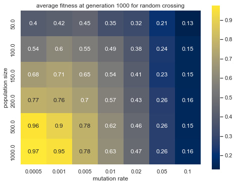
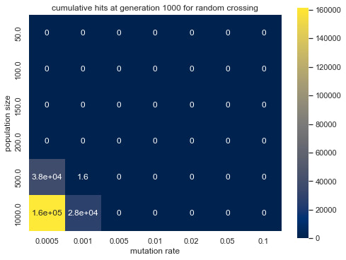
Alright then, time for a heatmaps. This is going to help with revealing the collective impact of mutation rate and population size.
# do a numpy array
fitness_random_matrix = final_gen_fitnesses['random']
hits_random_matrix = final_gen_hits['random']

fitness_midpoint_matrix = final_gen_fitnesses['midpoint']
hits_midpoint_matrix = final_gen_hits['midpoint']
Graph 3: average fitness at generation 1000 for random crossing
fig = plt.figure(figsize=(8, 6))
matrix = fitness_random_matrix
ax = sns.heatmap(matrix, annot=True, square = True, cmap='cividis', xticklabels=list(matrix.keys()), yticklabels=list(matrix.index))
ax.set_title("average fitness at generation 1000 for random crossing")
ax.set_xlabel("mutation rate")
ax.set_ylabel("population size")
plt.show()
Graph 4: cumulative hits at generation 1000 for random crossing
fig = plt.figure(figsize=(8, 6))
matrix = hits_random_matrix
ax = sns.heatmap(matrix, annot=True, square = True, cmap='cividis', xticklabels=list(matrix.keys()), yticklabels=list(matrix.index))
ax.set_title("cumulative hits at generation 1000 for random crossing")
ax.set_xlabel("mutation rate")
ax.set_ylabel("population size")
plt.show()
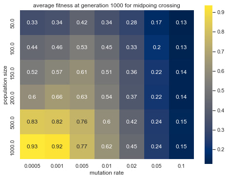
Graph 5: average fitness at generation 1000 for midpoing crossing
fig = plt.figure(figsize=(8, 6))
matrix = fitness_midpoint_matrix
ax = sns.heatmap(matrix, annot=True, square = True, cmap='cividis', xticklabels=list(matrix.keys()), yticklabels=list(matrix.index))
ax.set_title("average fitness at generation 1000 for midpoing crossing")
ax.set_xlabel("mutation rate")
ax.set_ylabel("population size")
plt.show()
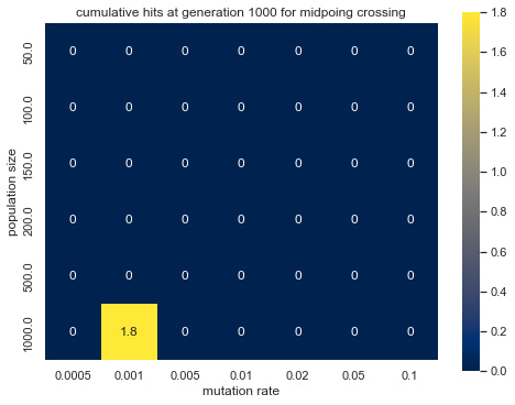
Graph 6: cumulative hits at generation 1000 for midpoing crossing
fig = plt.figure(figsize=(8, 6))
matrix = hits_midpoint_matrix
ax = sns.heatmap(matrix, annot=True, square = True, cmap='cividis', xticklabels=list(matrix.keys()), yticklabels=list(matrix.index))
ax.set_title("cumulative hits at generation 1000 for midpoing crossing")
ax.set_xlabel("mutation rate")
ax.set_ylabel("population size")
plt.show()
H2 Observations
Graph 1 plots the average fitness of the population over the evolutionary process in intervals of 10 steps. Looking at the graph, we can observe that the range of parameters tested gave a wide range of different results. In general, the population’s average fitness increases at a fast rate from the start and levels off over time. However, with different population sizes and mutation rates, the final fitness of the population level sustain at different values ranging from 0.1 to 0.97. This graph, however, is only an overview of all the experiments and does not clearly present the correlation between our variables of interest.
Graph 2 shows the number of individuals that had the exact genome as the target genome. All trials of the brown and pink experiments reached relatively high numbers, three trials of the yellow experiments took off, and all other experiments kind of lay at the bottom. This indicates that only a few combinations of parameters led to an evolution in which the target genome thrived.
Graph 3-6 shows the effect of population size and mutation rate on the simulated evolution. Observing the differences in brightness between random crossing (Graph 3, 4) and midpoint crossing (Graph 5,6), one can conclude that random crossing was slightly more effective than midpoint crossing. The effect of mutation rate and population size and between mutation rate and average fitness is more prominent and has a similar trend across the two crossing strategies. Namely, lower mutation rate and larger population size lead to higher average fitness
H2 Discussions
A likely explanation for the positive correlation between population size and average fitness is that a higher population size allows more genetic variation, just like in the real world. In this case, it is more likely for certain genes to show up in the population.
Seeing that there was a negative correlation between average fitness and mutation rate, one might suspect that a mutation rate that’s too high disturbs the genes and make inheriting genetic information less effective for shifting the population towards a single target genome. However, this might not be representative of the factors that drive evolution in nature and could only be used as an example of a very specific case of evolution.
For the difference between the two crossover strategies tested in this experiment, it is unclear from the data how to explain the difference in the effect on average fitness. In real-life crossovers in meiosis, the process is much involved as multiple chromosomes and multiple gene segments are exchanged. As a result, neither random crossing nor midpoint crossing accurately models real-life scenarios that, arguably, have characteristics of both strategies.
H2 Limitations
This experiment significantly simplifies evolution seen in Biology. It shortens the genome, directly selects genotype rather than phenotype, and defines a single target genotype rather than allowing a range of individuals to survive. Due to time limitations, this experiment is will be done this way to simplify calculations. Further experiments could include a more complex model that takes into consideration factors that are ignored in this experiment, but these are beyond the scope of this experiment.
As seen in Graph 1, some experiments were restrained to some very low fitness. In actual ecosystems, it might be the case that the population size will reduce significantly in this case.
By the look of the heatmaps, larger population sizes and smaller mutation rates are more likely to lead to higher fitness. As the heatmap is most intense at high population sizes and low mutation rates, it is unreasonable to extrapolate the pattern any further beyond the tested range. The optimal mutation rate for this task might well lie below the smallest tested value of 0.005 and would need further experimentation to be better understood.