Visualising #Pulaoread (Part 1)
#post/legacy #data-art #data-visualisation #python
This post originally appeared on the very first blog
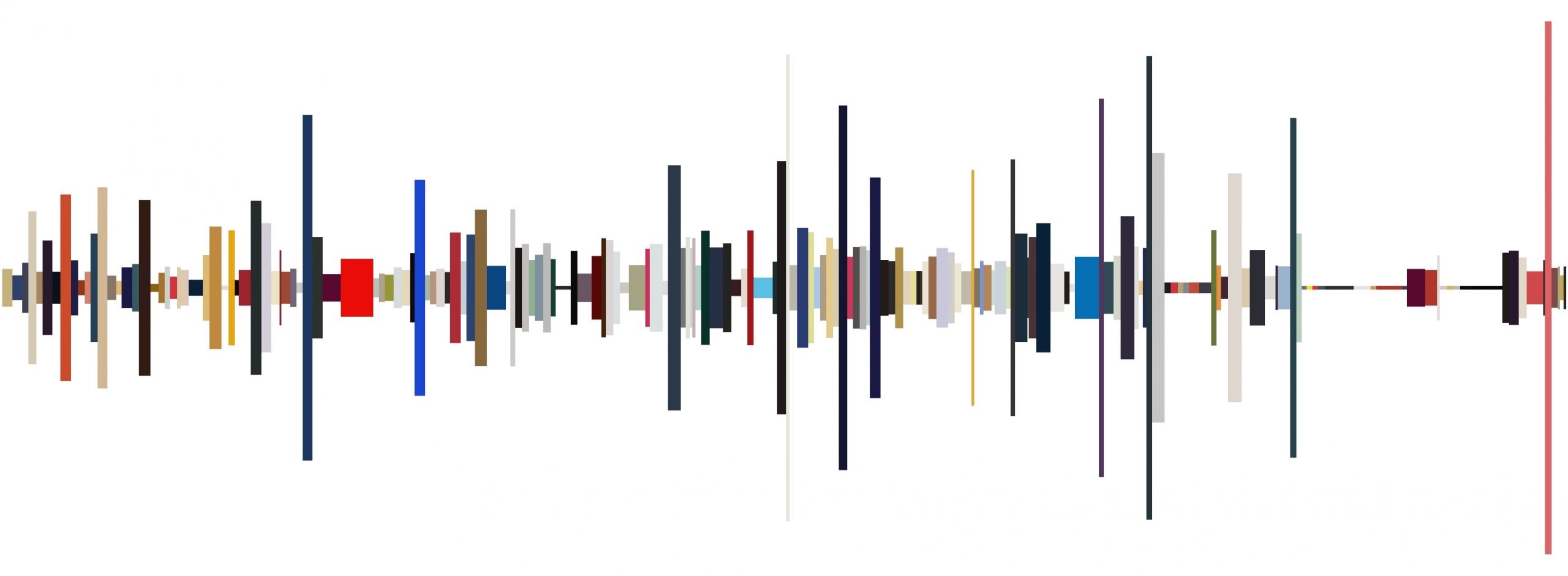
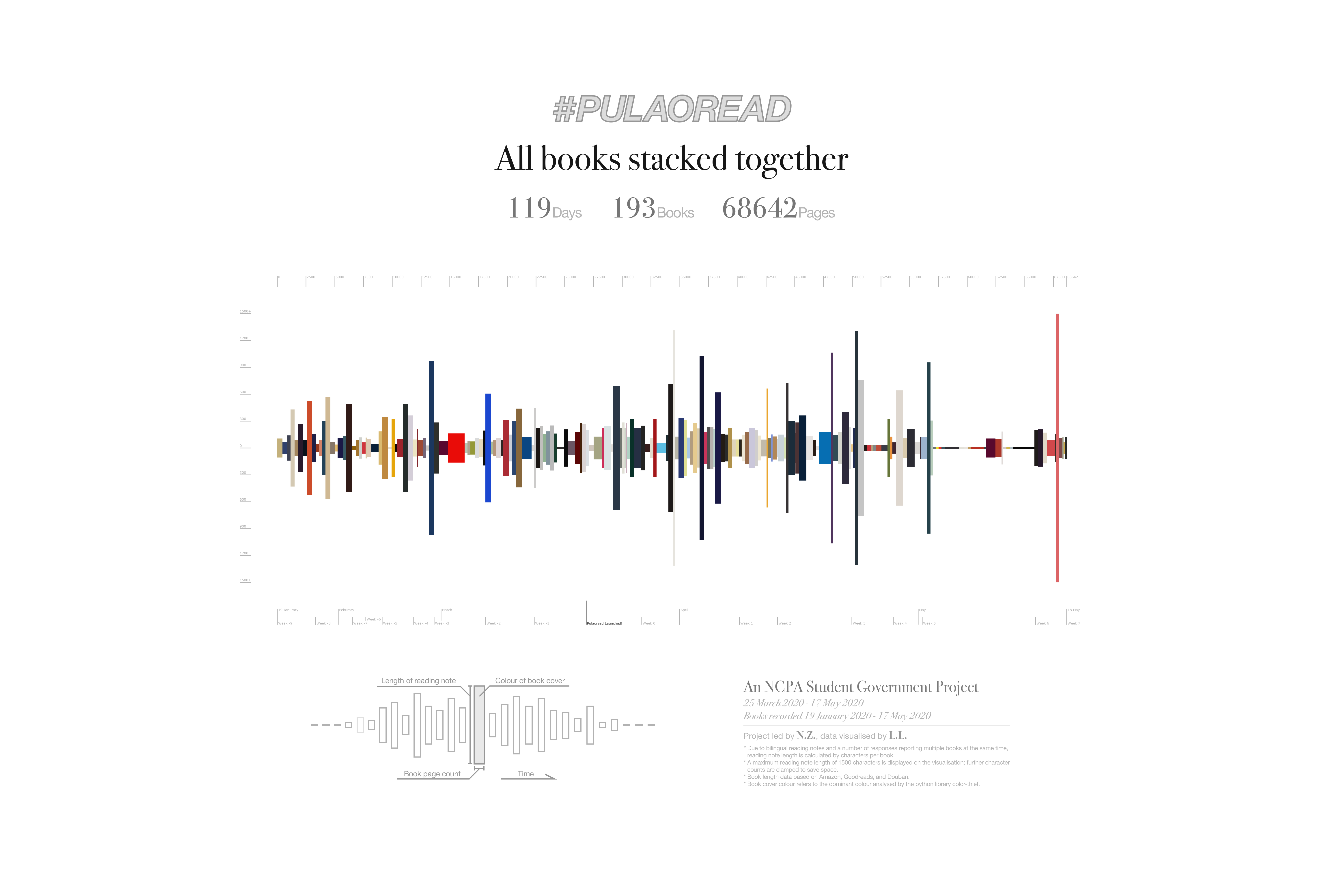
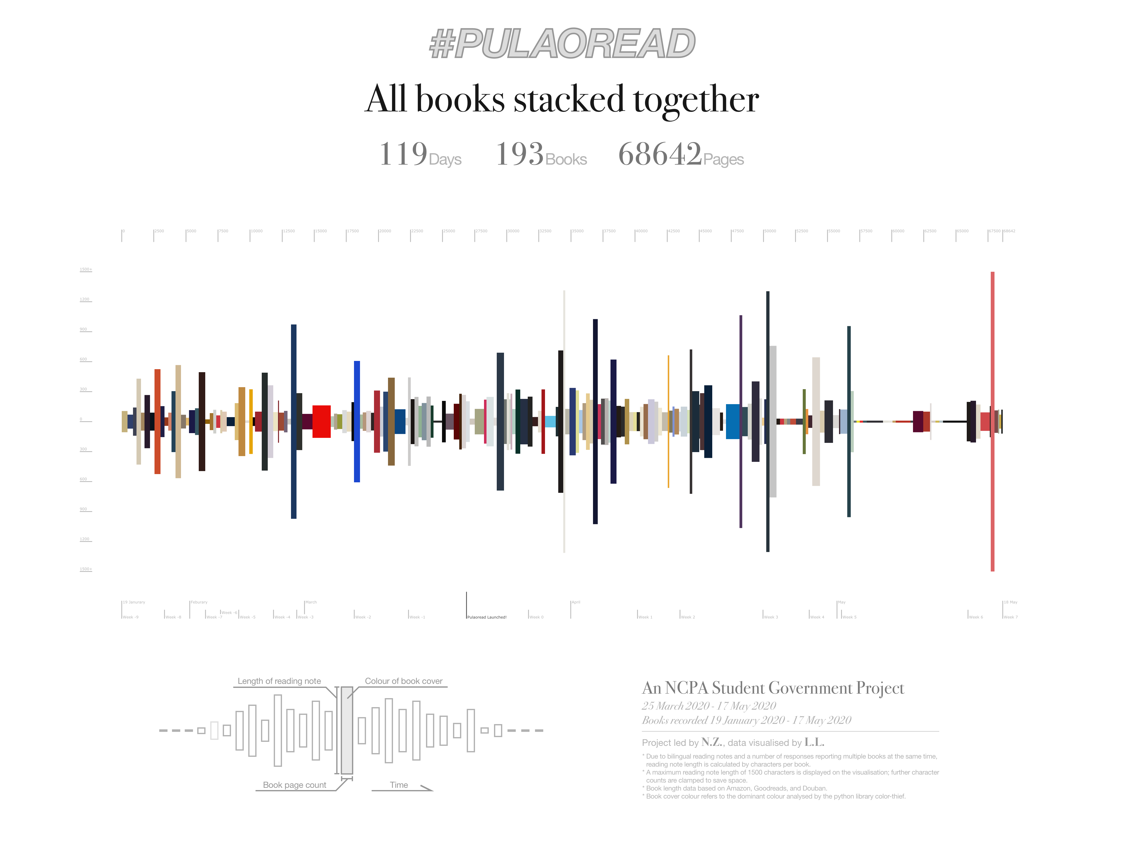
This is a visualisation of the data collected in the #Pulaoread project. Links to other parts will be available below once available.
- Part 1: Stacking the books (this post)
- Part 2: Readers, books, and authors
- Part 3: More colours
The concept is simple: stack every book together according to their time of completion, while utilising as many dimensions as possible to integrate information in a nondistracting way. At the end of the day, book length and time ended up on the horizontal axis, note length on the vertical, and rectangles are given the colour of the corresponding book cover. The primary inspiration came from a game called Stack, some further inspiration came from this.
H3 The Visualisation Process
H4 1. The drawing board
Don’t remember how I came up with the idea, presumably during a shower, but here’s the thing that ended up in my notebook.
Original sketch: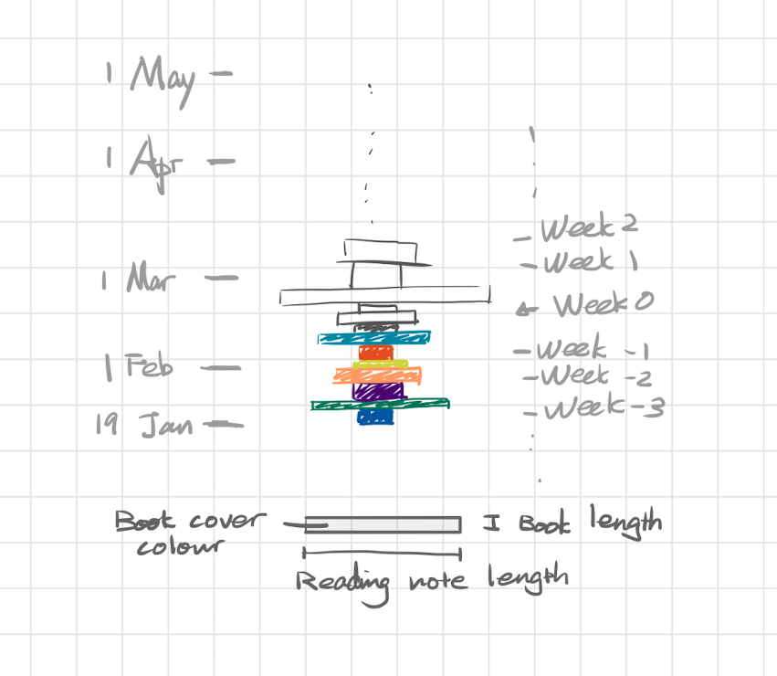
H4 2. Data parsing
First, the raw data exported from Microsoft Forms had to be parsed heavily (especially because people filled out the form a million different ways, including different languages; the form’s text fields should have been made more specific than that btw, but anyway that was the data I had to work with).
It turned out that a spreadsheet got the work done, though it was probably not the most elegant solution as many tasks required taking into account multiple possible source formats. (I mean… there were literally three different dashes used and that was super annoying. This is probably why they say data scientists spend most cleaning data rather than analysing data)
Function to isolate the book name: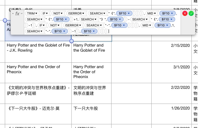
And the author: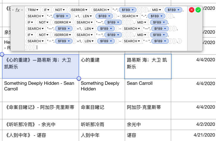
H4 3. Additional data collection
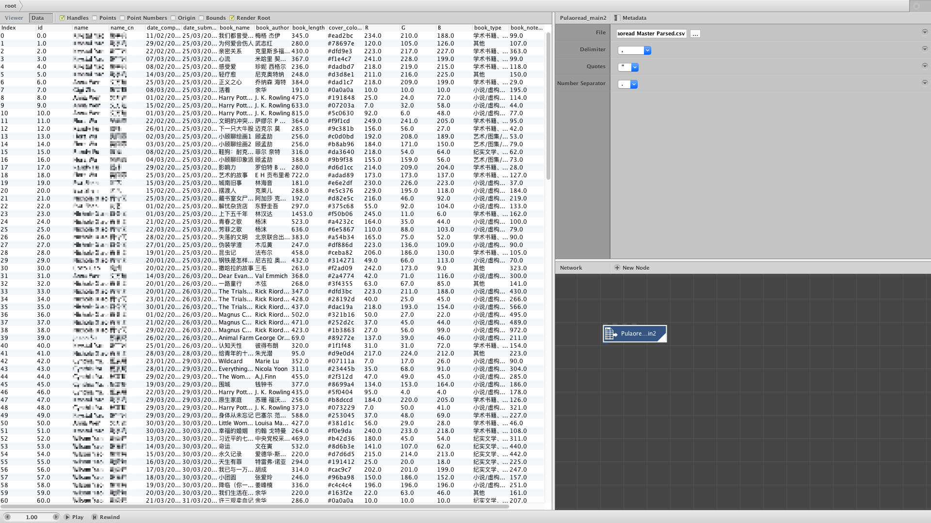
The reading form did not ask for the book length nor cover colour (that would be stupid), so the missing information had to be collected afterwards. The initial plan was to use Goodreads API but it didn’t work out quite well as some Chinese books are not on Goodreads (plus the fact that Goodreads API’s terms prevent storing their data).
The revised plan was to manually look for the number of pages while saving the cover image and then somehow generate the covers’ dominant colour via an automated process. It took less than an hour to go through the 193 books so that was not as bad as I had imagined (larger data set would require some different method).
The cover images were then analysed by the python library color-thief. A script fed the image files into the analyser and recorded the results in a text file. The analysis process did take a while and got stuck the first time when two images were not jpeg. Anyway, here’s the code:
from colorthief import ColorThief
from datetime import datetime
start_index = 0
end_index = 192
%%writefile pulaoread_colour.txt
Initialising
with open('pulaoread_colour.txt',mode='a') as log:
  log.write("Generating colour at" + str(datetime.now()) + '\n')
n = start_index
while n <= end_index:
  with open('pulaoread_colour.txt',mode='a') as log:
    overall_colour = ColorThief('pulaoread_covers/' + str(n) + '.jpg').get_color(quality = 1)
    colour_hex = '#{:02x}{:02x}{:02x}'.format(overall_colour[0], overall_colour[1], overall_colour[2])
    print(colour_hex)
    log.write(colour_hex + "\n")
  n = n + 1
H4 4. NodeBox!
So now the data was ready and can be imported into NodeBox.
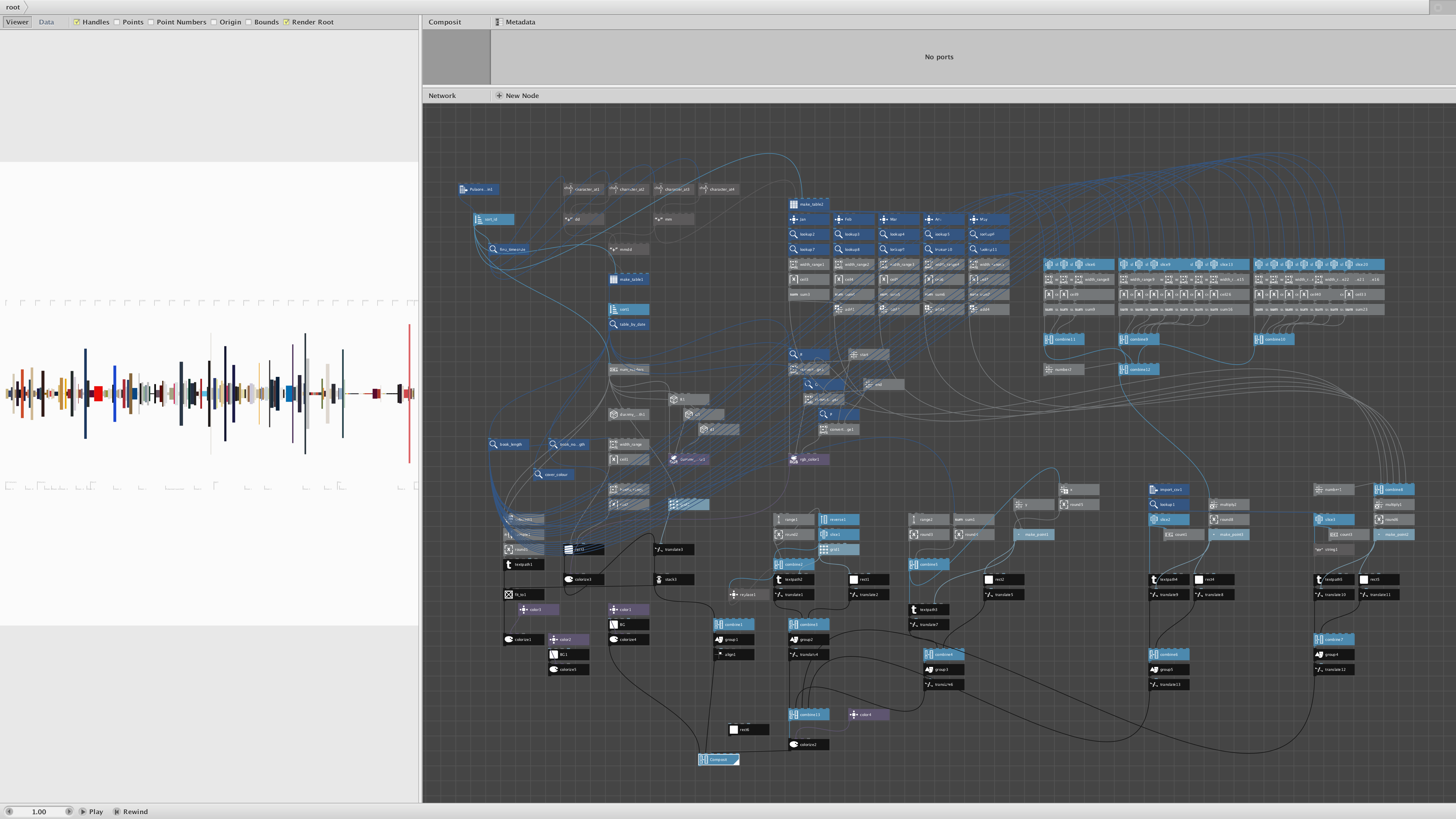
A while later, proof of concept! It did take some time to get around with NodeBox though, as it’s the first time I used it. There was, however, a problem with the date sorting. The completion dates were formatted dd/mm/yyyy so NodeBox’s sort prioritises the date before the month, which was not what was intended.
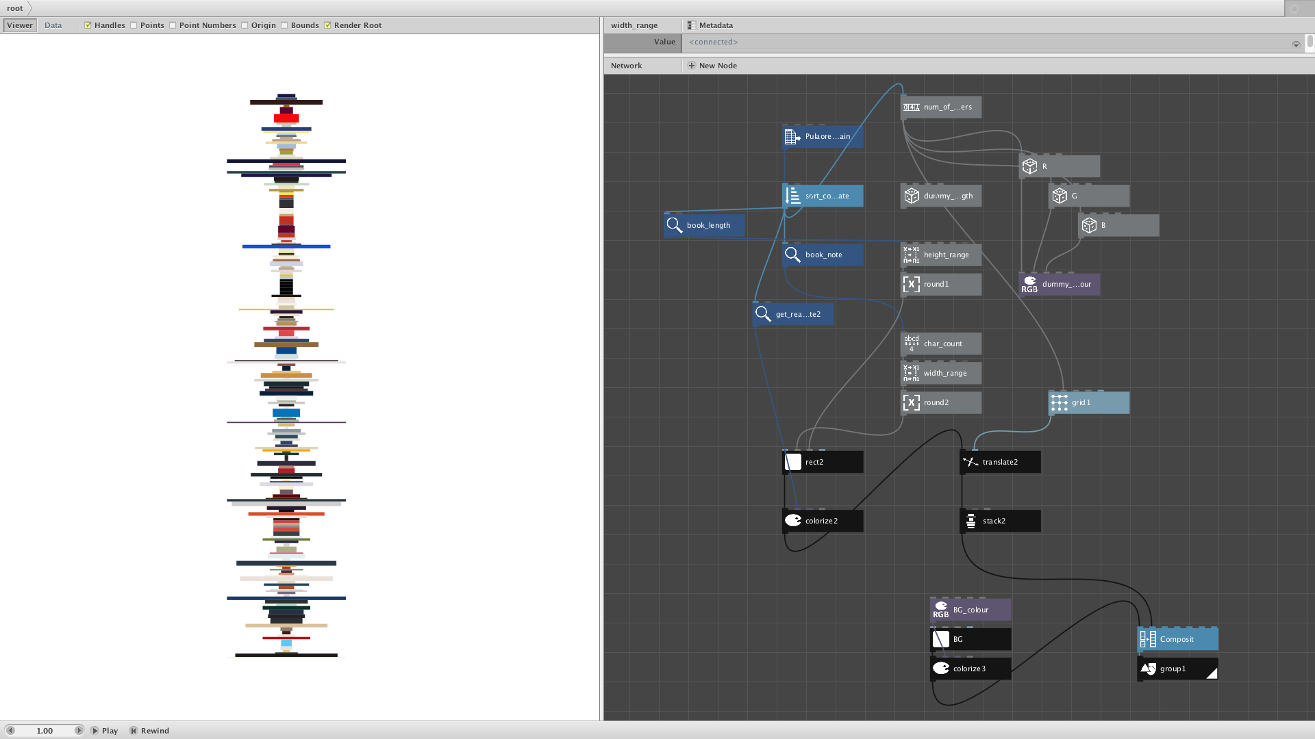
After playing around with the sorting, changing the orientation, tweaking the scalings, and adding the scales, everything looked fine… Except that the network was probably too wet and ugly, but no one cares as long as it works I guess.
H4 5. Graphics
Adding some texts and a diagram showing how to read the visualisation, I guess it’s done? Full resolution image down below.